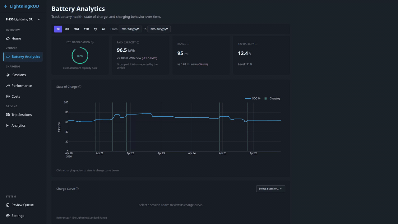
Battery Analytics
The battery analytics page (/battery) tracks long-term battery health, state of charge, charging behavior, and the 12V low-voltage system for the active vehicle.
Date Range Filter
Pick 7d, 30d, 90d, YTD, 1y, or All from the filter bar, or set a custom From/To date pair. The selection is stored in the URL (?range=… or ?date_from=…&date_to=…).
Health Summary Cards
Two summary cards appear at the top:
- Est. Degradation — current pack capacity as a percentage of the vehicle's rated gross capacity, with last-reported / factory / delta kWh beneath the gauge.
- HV Pack Telemetry — a 4-metric grid for battery temperature, voltage, amperage, and power. Each metric shows the latest value plus a 7-day sparkline, with a single freshness timestamp for the card.
Cards use the most recent ev_battery_status record. If Home Assistant does not provide a metric, the matching tile shows a "no recent data" state.
Usable vs gross capacity
LightningROD tracks two capacity numbers per vehicle:
- Usable capacity is the energy you can actually drive with.
- Gross capacity is the full battery size reported by FordPass.
The health card compares gross to gross so a fresh pack reads close to 100%. If the two values are mixed up, the percentages will be wrong. Both values live on the vehicle record in Settings → Vehicles and can be filled from the preset table.
SOC Timeline
The main chart shows state-of-charge over time, with:
- Color-coded charging regions -- brighter green areas highlight periods where power was positive, so charging sessions stand out from rest
- Click-to-drill -- click a charging region to filter the Charge Curve panel below to that session
- Gap-aware -- data gaps appear as breaks instead of connected lines
Large ranges are simplified on the server to keep the page fast even with years of data.
Battery Temperature Over Time
A dual-line chart below the SOC timeline showing battery pack temperature (solid) and outside-air temperature (dashed) across the active date range. Charging sessions are overlaid as shaded green regions so you can see what the pack was doing during charge.
The card lazy-loads when it scrolls into view.
Charge Curve
A charge curve with SOC % on the X-axis and kW on the Y-axis. The session picker defaults to the most recent session in the active range, regardless of charge type. Switching sessions only swaps the curve — the rest of the page stays in place.
Up to three lines can appear:
- Reference curve — a pre-configured model curve for the active vehicle (loaded from
reference_charge_curves/*.json). Hidden for AC sessions. - Average curve — your own average across recent DC sessions.
- Session curve — the specific session selected above, if any.
AC sessions cap the y-axis at 25 kW; DC sessions keep the 200 kW cap.
A temperature toggle in the legend lets you overlay battery temperature as a second axis.
Fallback
When fewer than 3 detailed battery_status points exist for a session, the app draws a simple line between the start and end SOC. The chart still renders, but the result is less precise.
Battery Degradation
A scatter plot of usable capacity against odometer mileage (km or mi depending on units) with a projected trend line. Date-based degradation is used only when odometer data is missing.
Performance Notes
- Secondary charts (battery temperature, charge curve, degradation) load when you scroll to them instead of on the initial page load.
- "All"-range queries use server-side downsampling to keep response times reasonable, even with years of data.